





VK Music app
redesign
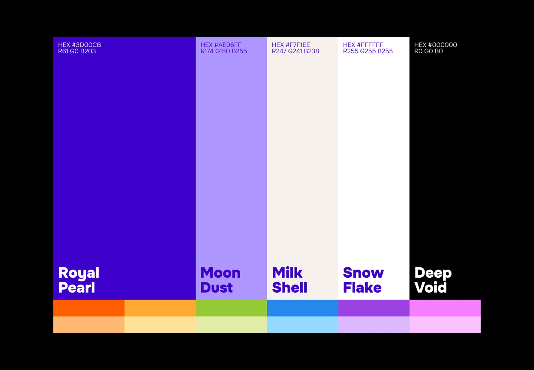
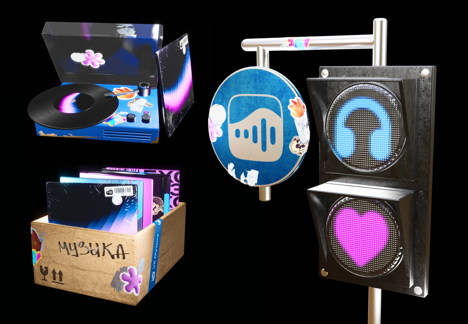
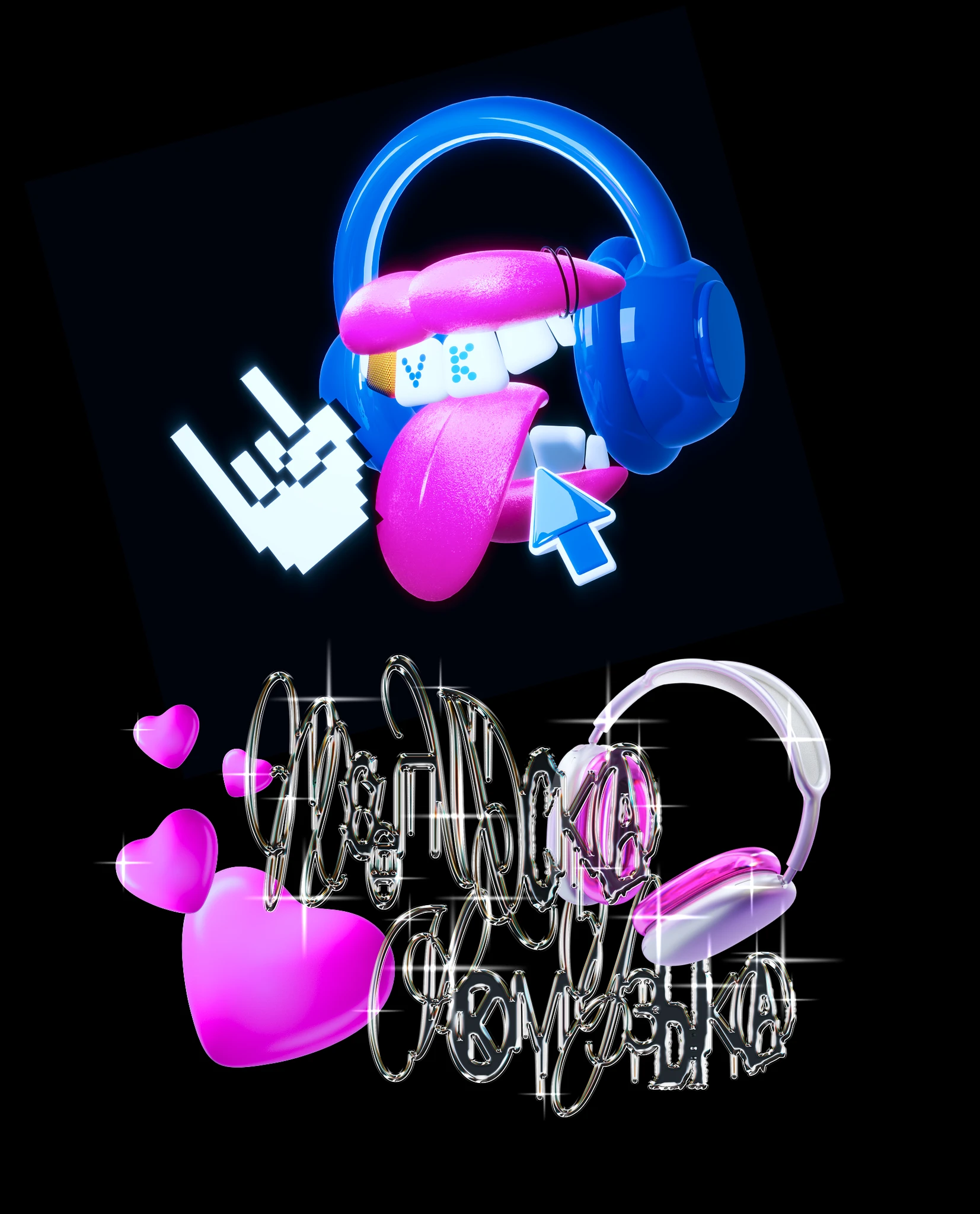
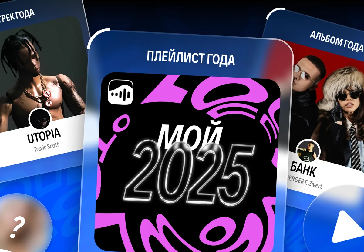
A music app should feel as emotional as the music itself. VK Music held two different worlds in one place: endless algorithm-driven recommendations and the music users collected themselves. The redesign set one goal: make each block instantly recognisable, and give the whole app one shared visual language.
Try VK Music app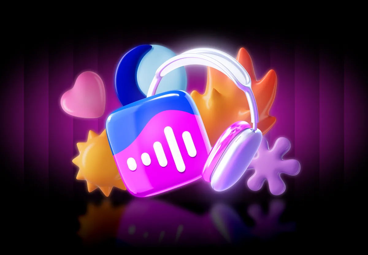
Tab bar icons
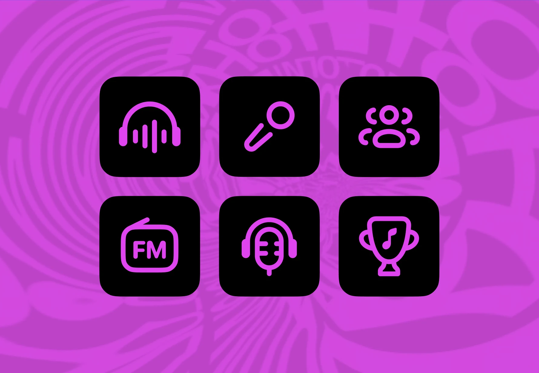
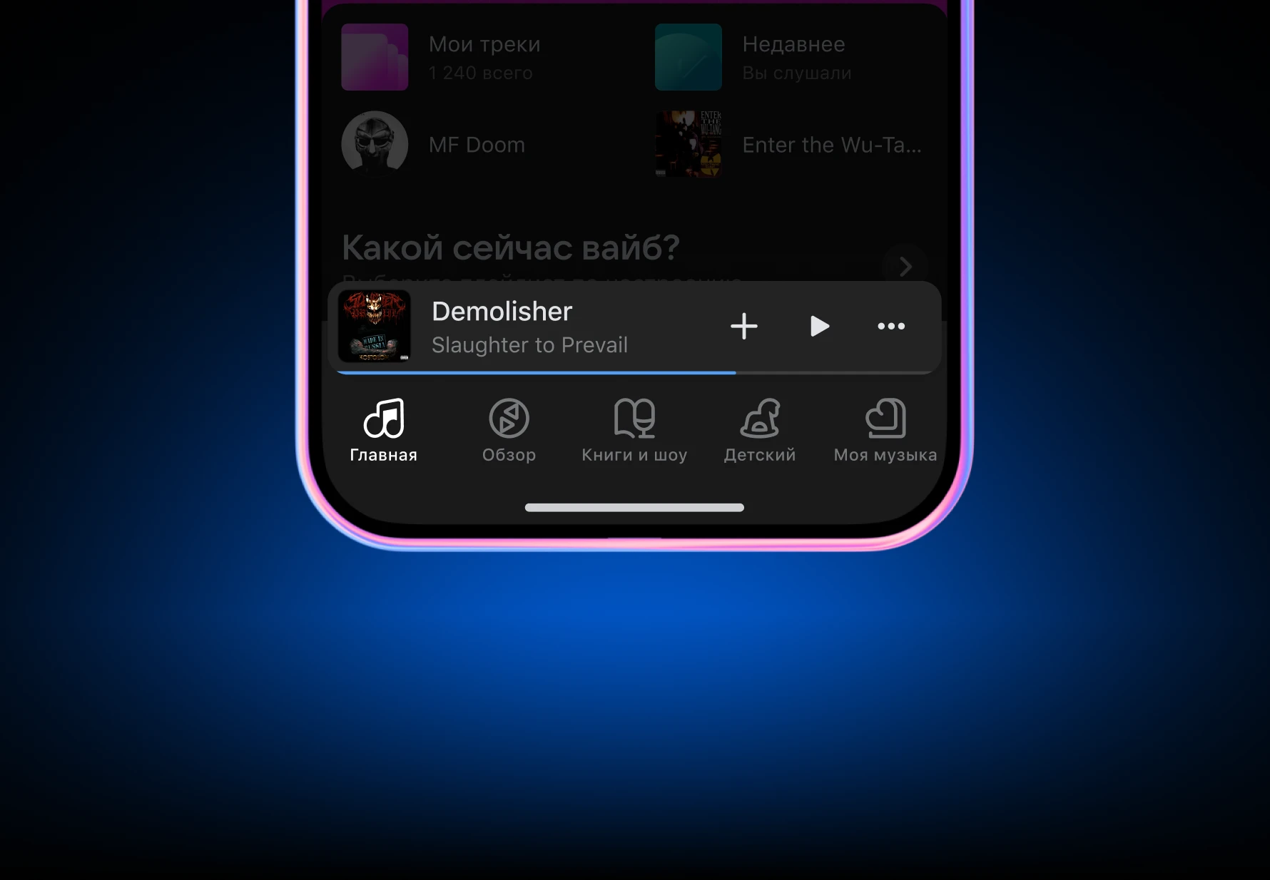
I designed a new set of icons for the tab bar, refreshing them to sit better with the new redesign style. The goal was recognition: the icons had to feel like VK Music even on their own. Beyond their static appearance, they were prepared for future animation, with attention to proportions, balance, and clarity of motion.
Quick Access buttons
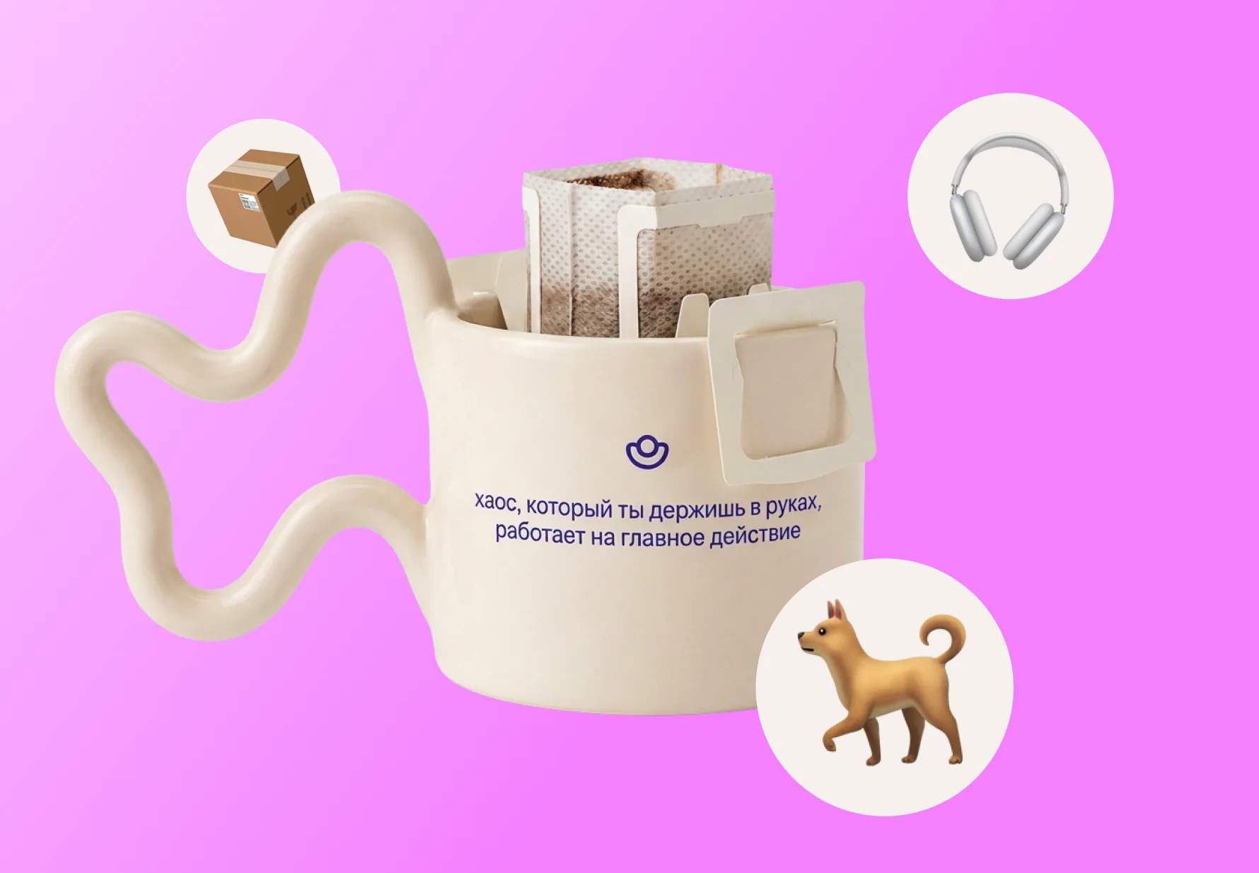
For the Quick Access section on the home screen, I kept the previous design but refreshed it for the new style, focusing on clear metaphors. My Tracks represents the user’s personal music collection, while Recently Played is built around the idea of time and listening history. The button features a clock with a small easter egg in the hands: the time it shows is when I first told my wife I loved her.
~20%Click share
UGC tracks cover
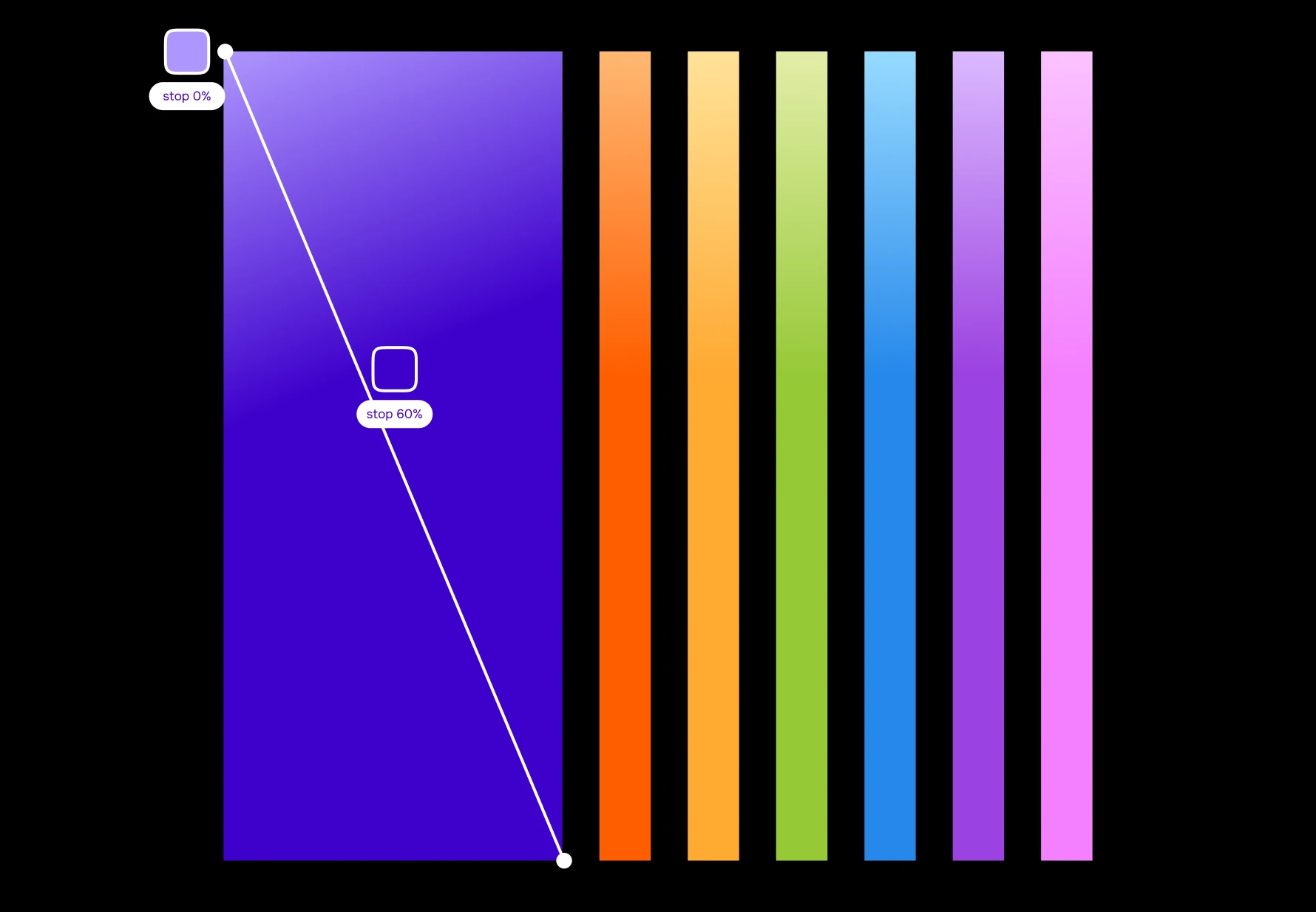
I designed a pack of six covers for user-generated tracks that have no official artwork. The task was to combine two roles in one image: a placeholder in the player and a good-looking cover users would not be shy to share. I carried the music note over from the tab bar and built the pack in the brand colors. The app assigns a cover automatically, picking a color that does not repeat in the same row of the collection.
Curated by Algorithms playlist covers
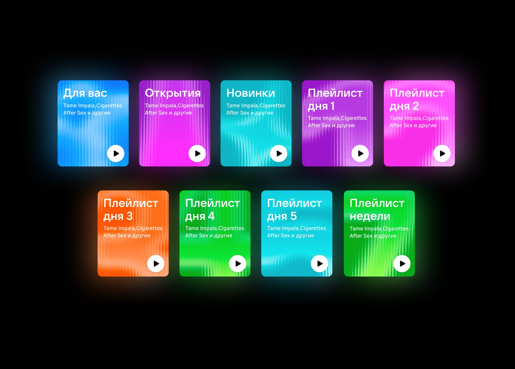
This block is a carousel of personalized playlists generated from the user’s listening habits. While working on VK Mix, I defined its core visual constants — split glass, brand colors, and a metaphor per playlist — and carried them across every algorithmic block. I designed nine covers, each built on a metaphor that reflects the mood or theme of the playlist.
+~15%MAU
Moods & Activities buttons
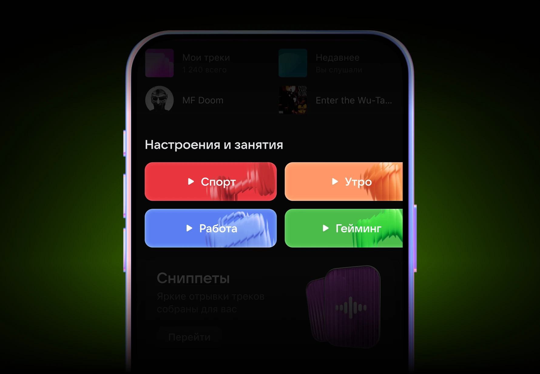
This is a new block with quick access to an endless stream of music for specific moods and activities. It belongs to VK Mix, so it shares the same visual system, but it had to stand out as a highlight. I designed twelve covers, each with a clear attribute of the activity: coffee for morning, a dumbbell for sports, and other instantly readable cues.
+~10%MAU
Listen to Each Other block covers
This block was designed to stand out visually from other recommendation sections. It had no covers before, so I proposed a universal cover to top the section, colored in brand colors. The visual concept combines two metaphors: two human heads facing each other across a screen, and a percentage sign for the level of musical taste match between users.
Artist Mix playlist cover
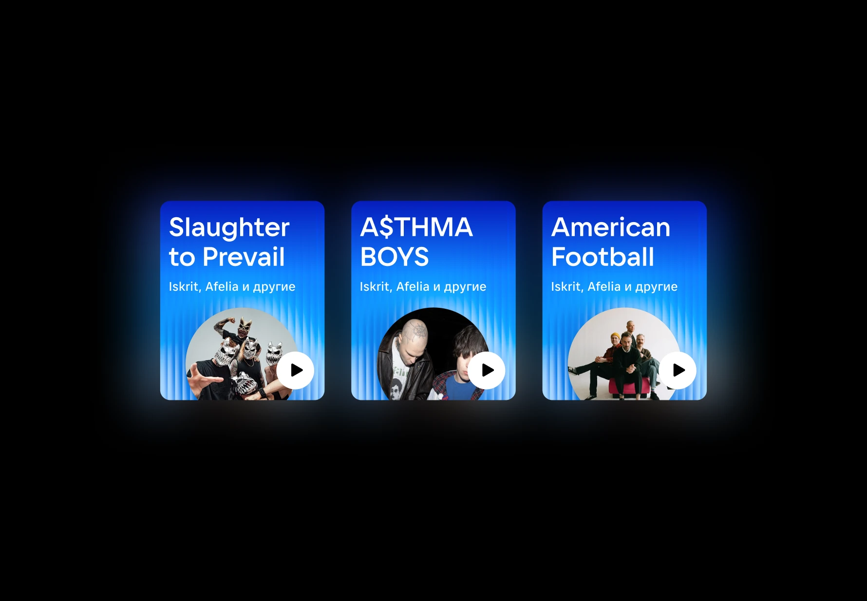
The recommendation logic here is built around artists similar to the one selected, so the cover follows the same VK Mix system as Curated by Algorithms but puts the artist’s photo first. I designed one master cover template to keep every artist mix consistent.
~10%Time spent on the Main page
App Store & Google Play screens
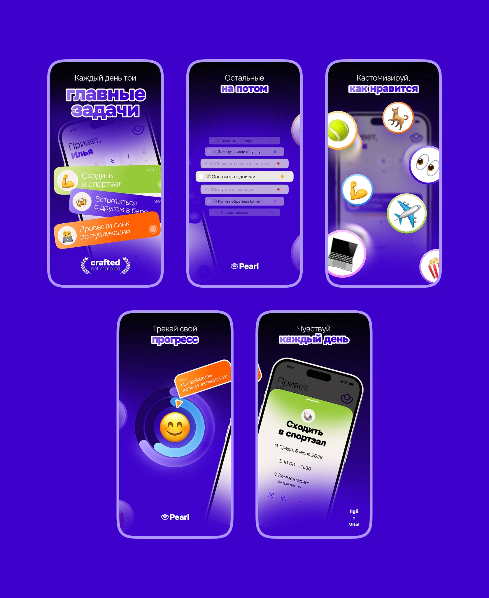
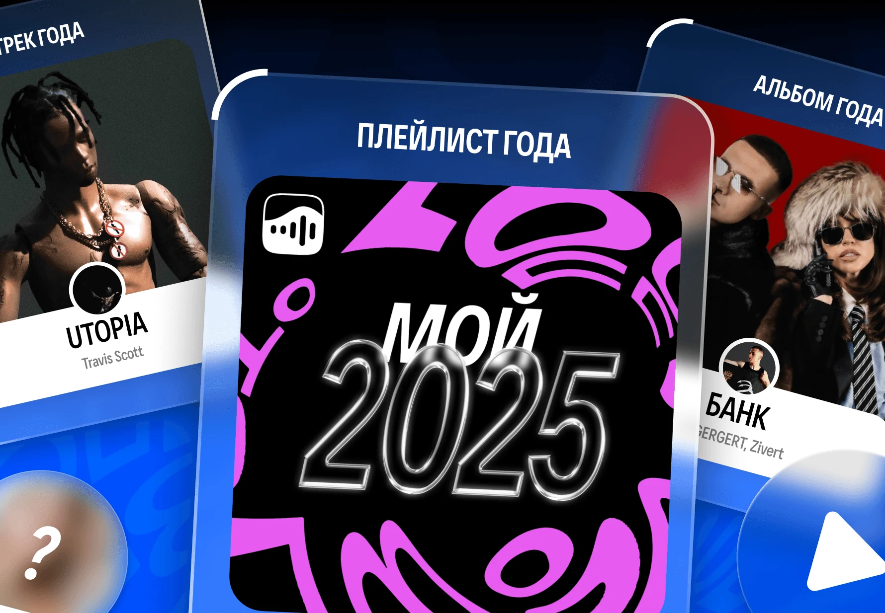
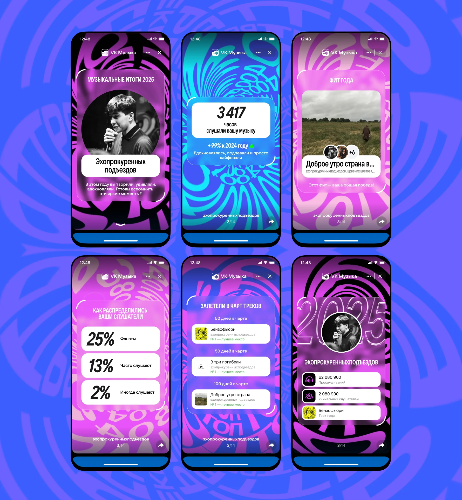
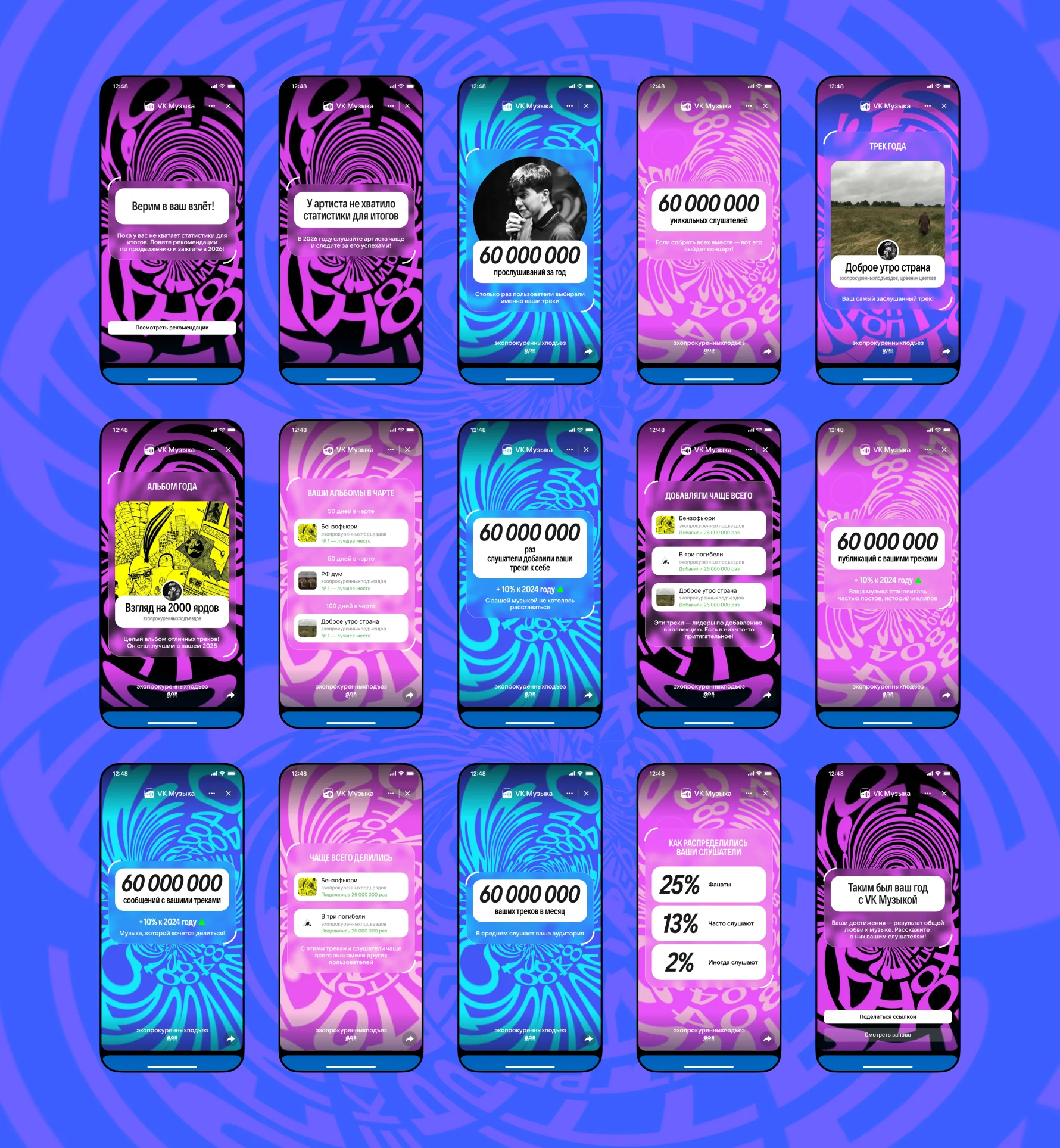
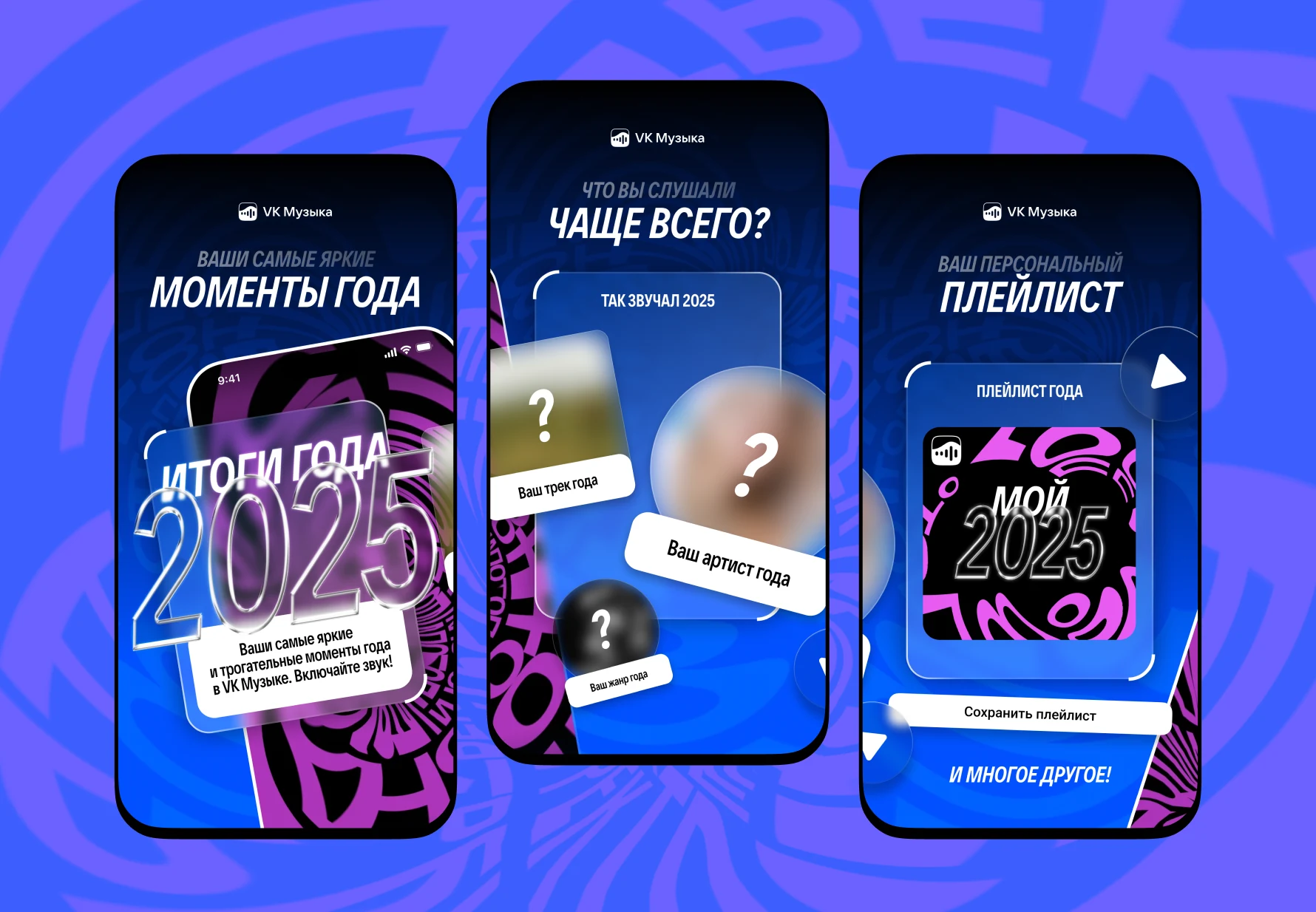
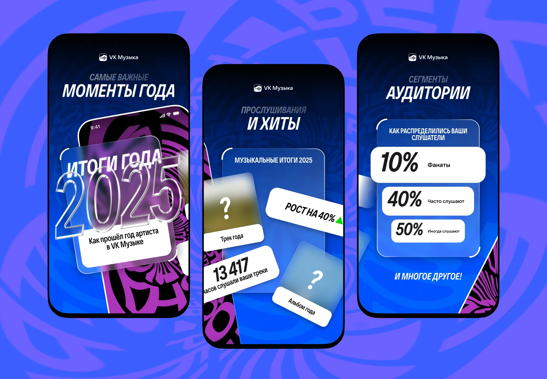
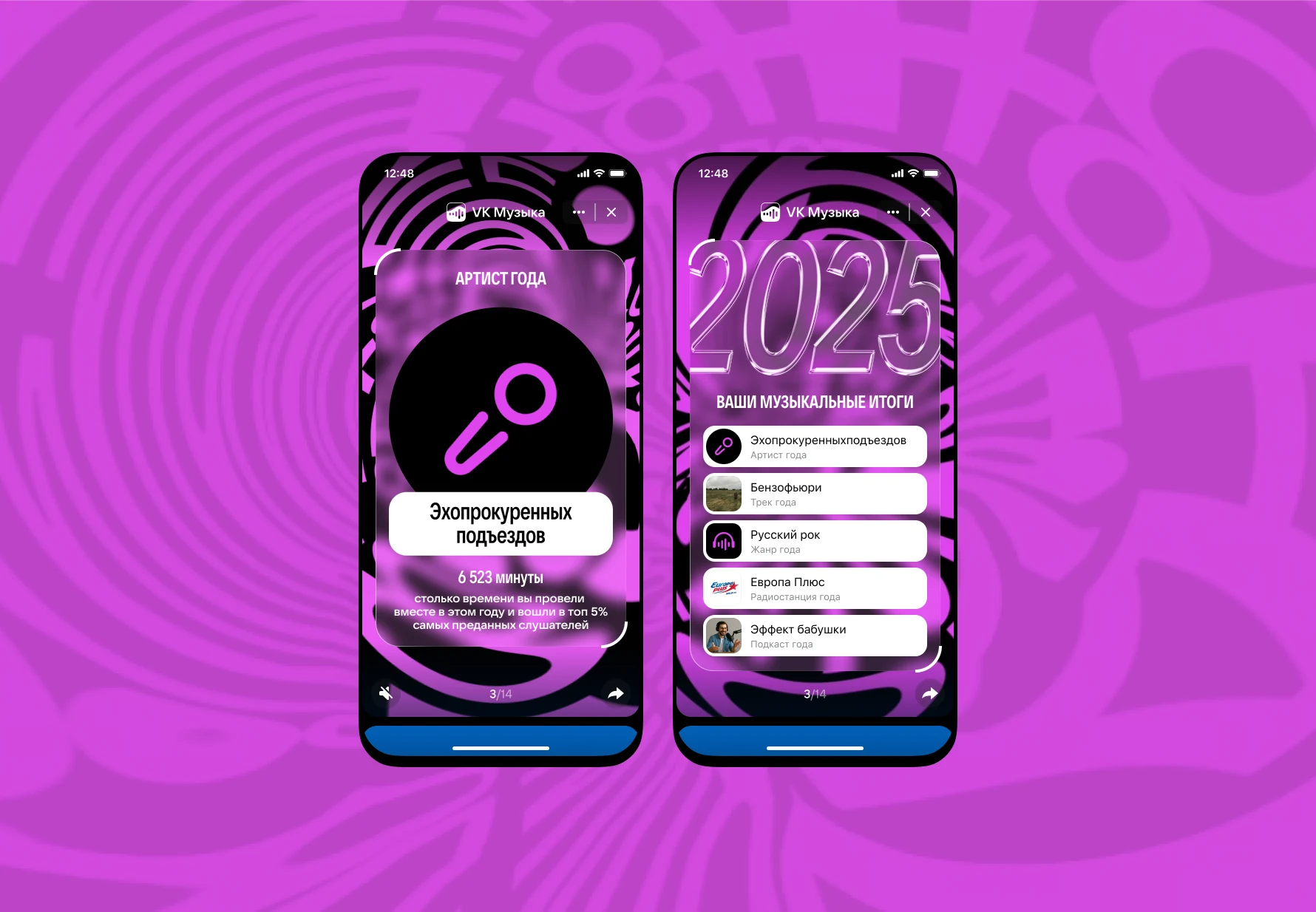
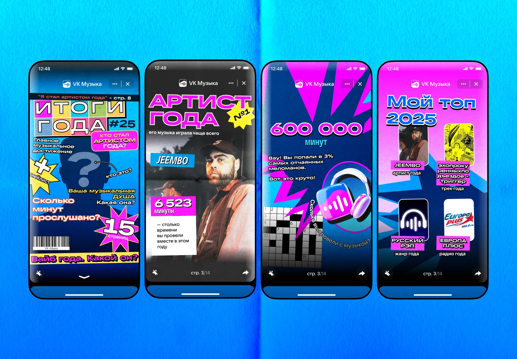
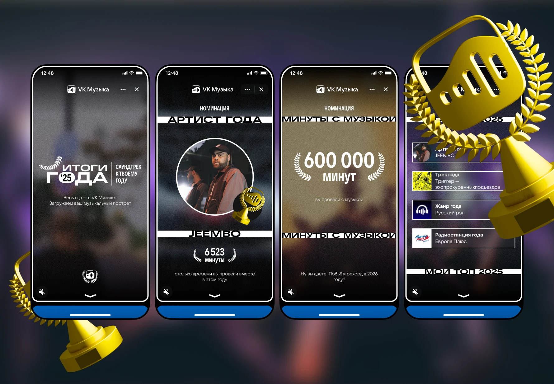
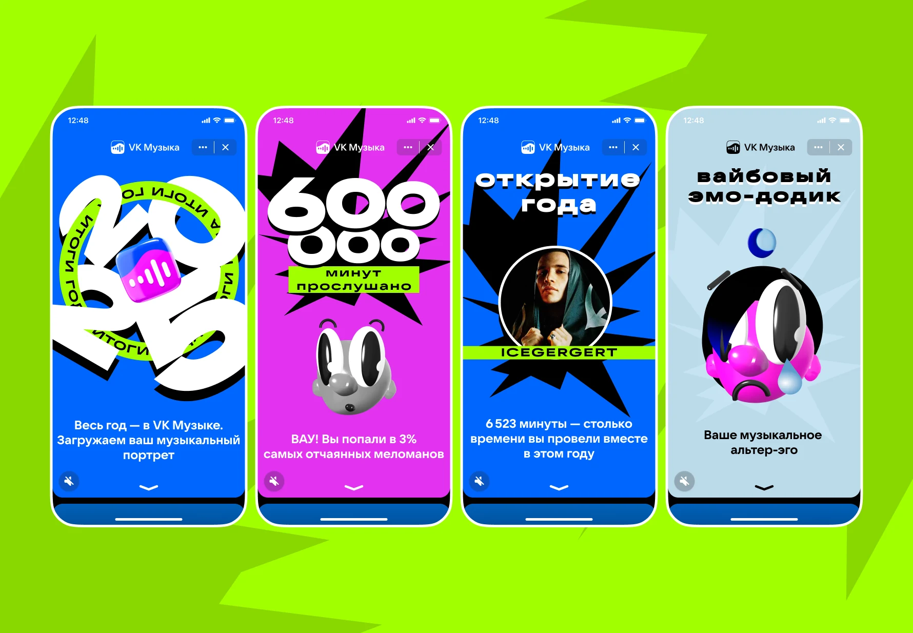
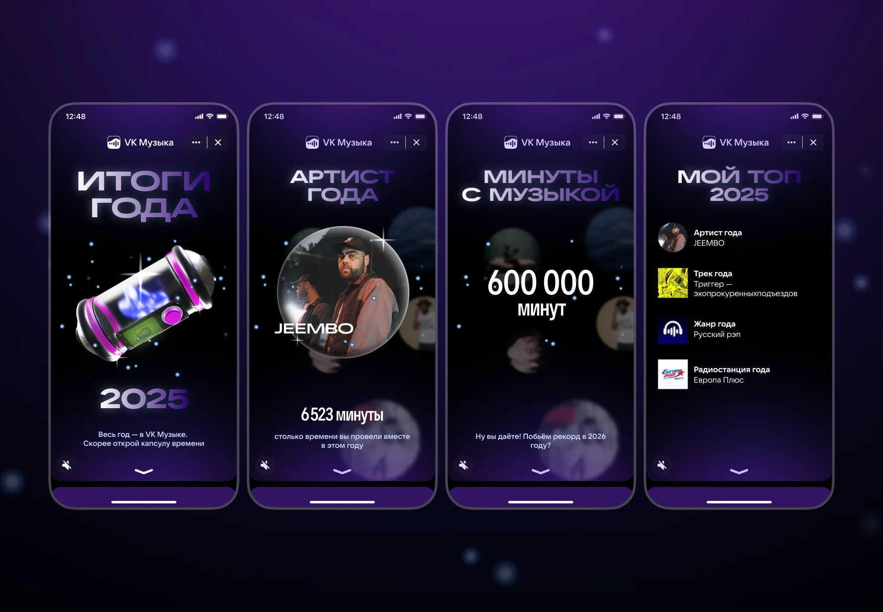
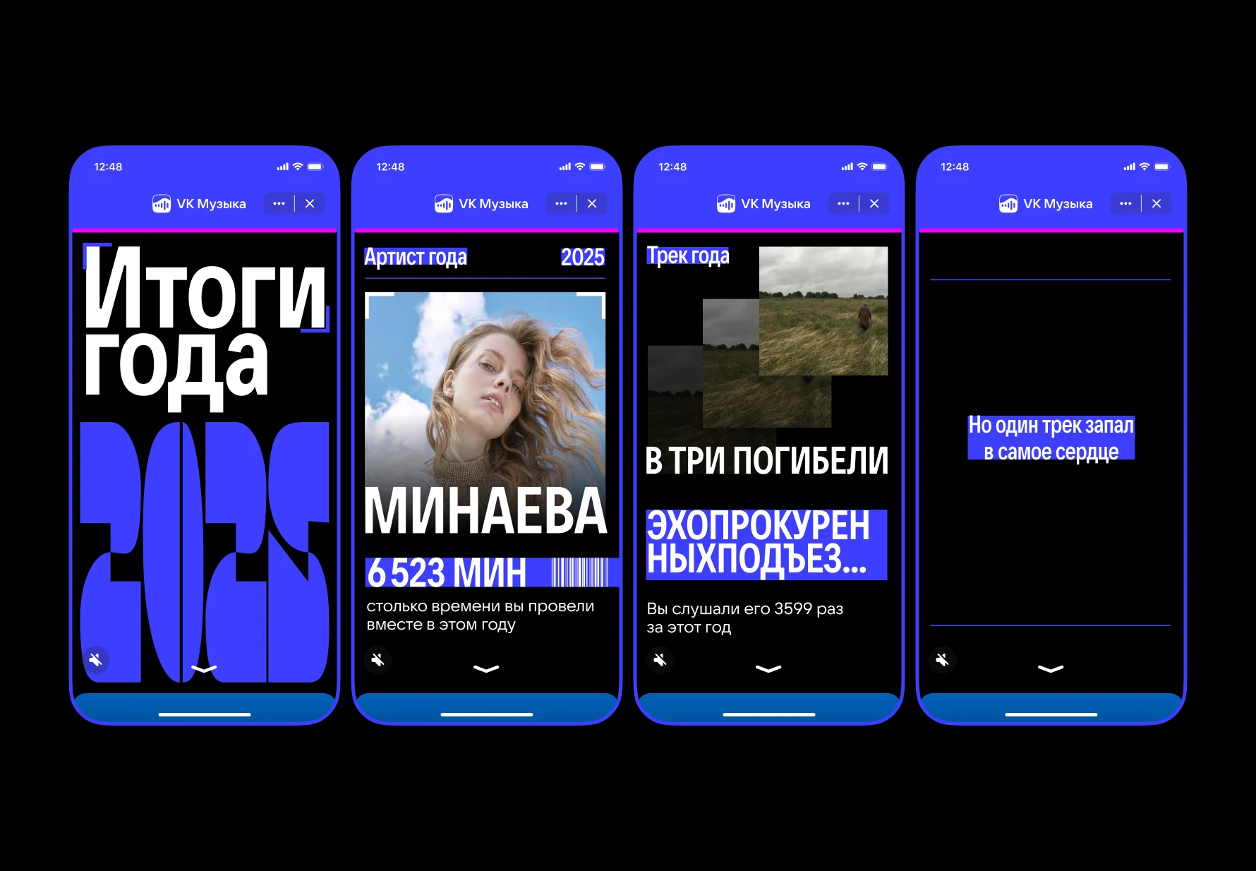
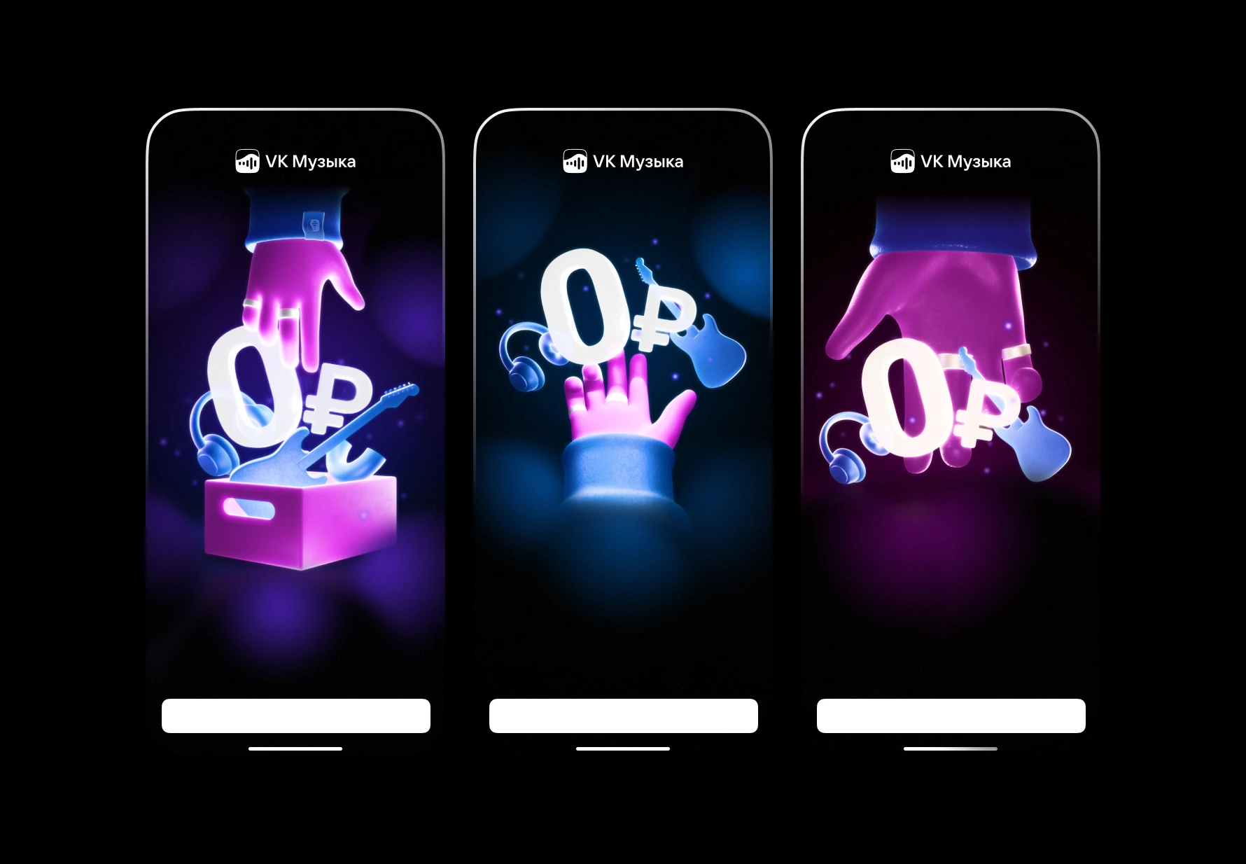
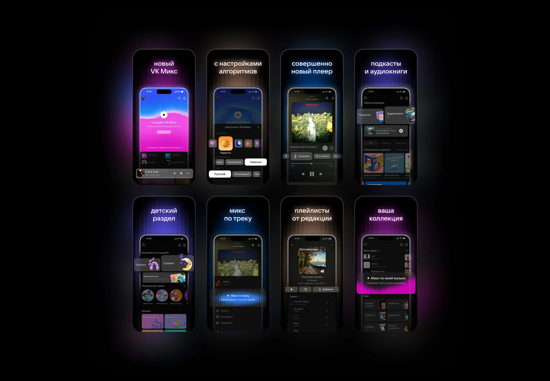
For the redesign release, I updated the store screens: eight for iOS, plus adaptations for Android. Each one shows a key benefit of the app on the device, in the new brand style. The key constraint was a single, fixed phone mockup position without overall motion or dynamic compositions, focusing instead on screen content and clear communication of the redesign.
VK Music redesign system
One system for the two halves of the app: the algorithm-driven side, and the user collection side.
9Curated by Algorithms covers
12Moods & Activities covers
1Artist Mix master template
1Listen to Each Other cover
5tab bar icons
2Quick Access buttons
6UGC track covers
8+store screens, iOS & Android